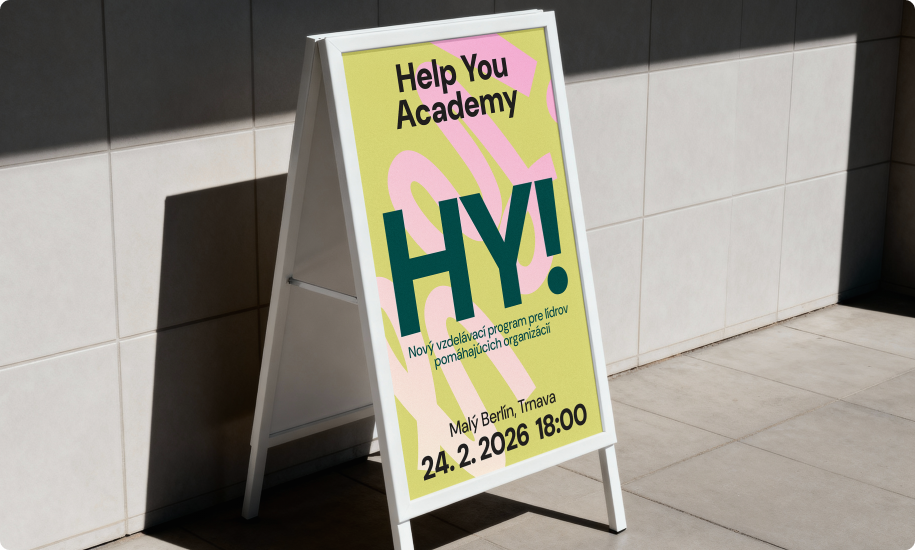
Some organizations help people. Help You Academy helps those organizations. That's a beautiful mission and a genuinely hard one to brand. Our task was to build everything from zero: a name that would work in Slovak and abroad, a brand strategy and tone of voice with warmth without sentimentality, and a full visual identity.
We started with strategy and tone of voice by mapping the audience of advocacy leaders, patient organizations, NGO representatives, and community builders. The brand had to feel credible enough for institutional partners and open enough for a younger generation thinking about how to get involved.
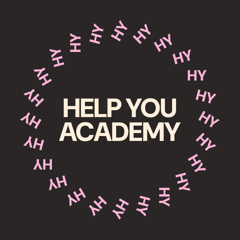
With the name we wanted something easy to remember, easy to say abroad, and rich enough to carry the meaning. HY Academy landed on all three counts. HY is shorthand for "help you” - the mission in two letters. Read phonetically, it's "hi” as an invitation, a welcome. Academy anchors the educational frame and gives the brand the professional weight.
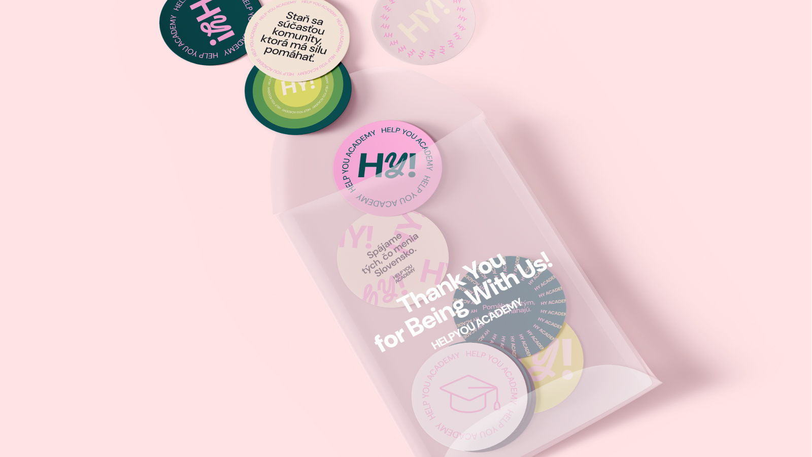
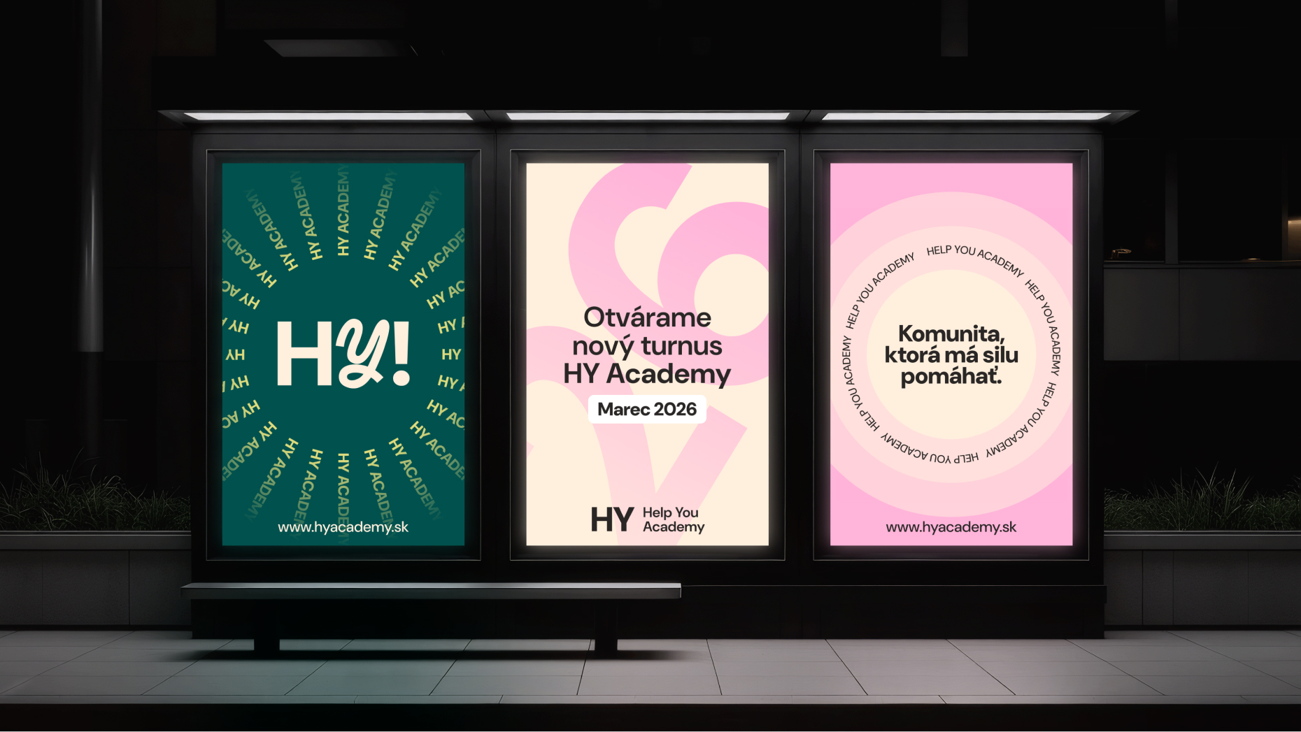
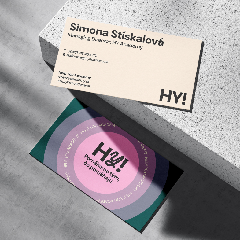
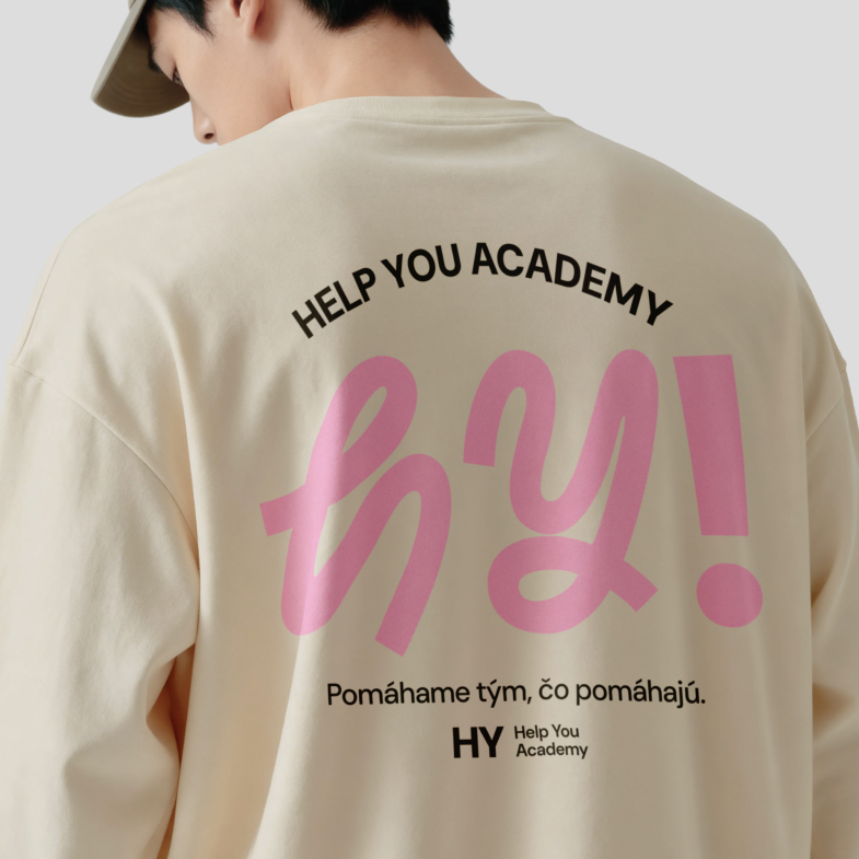
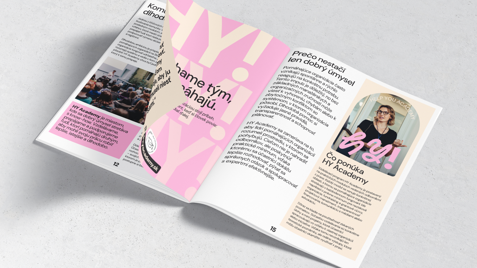
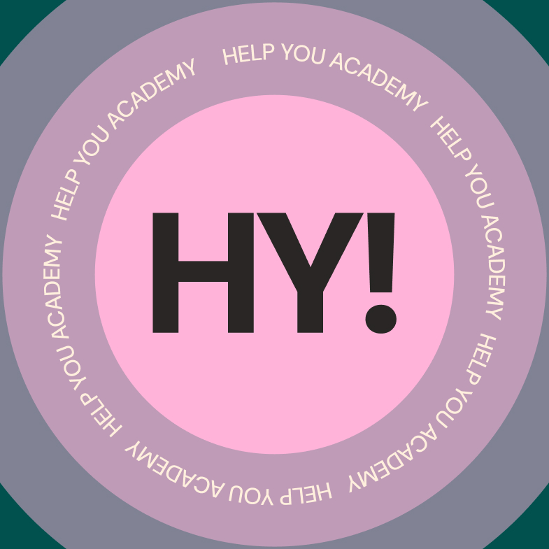
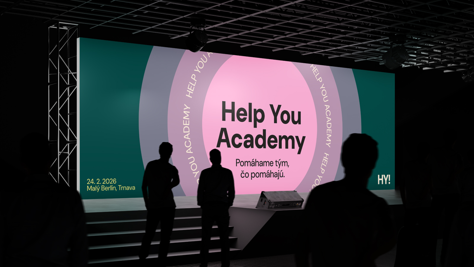
The identity carries the same double meaning and a palette led by pink, backed by deep green, lime and cream. Concentric circles echo communities radiating outward, while the typography keeps everything clear and modern. We then extended the system across every surface from business cards and brochures to apparel, packaging and pin badges.
Outcome
HY Academy launched with a name that does three jobs at once, a voice that treats its audience like professionals and friends, and an identity system flexible enough to live on a ministry document and a merch drop without breaking. A brand for the people who help the helpers.
Skills
Brand Strategy
Design
Tone of Voice
Visual Identity
More work
MILROSE | One Home. Two Worlds.
Naming - Brand Strategy - Visual Identity - Digital Campaign
HY Academy | A brand for the people who hold up the helpers.
 A brand for the people who hold up the helpers.





 More work