We crafted a visual identity for "Zdravie v hrsti" (Health in Your Hands), a Slovak men's health campaign tackling testicular cancer awareness. The brief was straightforward but tricky. To create something that gets young guys to actually pay attention to a topic they'd rather avoid. The identity needed to cut through tired medical clichés while staying credible enough for healthcare professionals to take seriously.
We threw out the typical healthcare playbook completely. Instead of sterile whites and clinical blues, we went bold with electric blue, lime green, vibrant purple, and punchy red, colors that actually stop you mid-scroll. The typography mixes a condensed sans-serif that demands attention with a more human secondary font that keeps things approachable. We built an entire social media universe around cheeky hashtags turning awkward medical terminology into something guys might actually share with their friends.
The campaign hinged on transforming clinical self-examination guides into engaging carousel posts, interactive story templates, and educational content that feels more like lifestyle advice than medical instruction. Every piece, from business cards to trade show booths, reinforces the central hand symbol while maintaining enough visual flexibility to work across wildly different contexts.
Result
The identity successfully made an uncomfortable conversation feel urgent but manageable. The vibrant visual language cuts straight through healthcare noise while keeping the medical gravity intact. Young Slovak men now have a brand that speaks their language. Direct, bold, and unapologetically modern. The flexible design system scales from intimate social posts to large-scale awareness campaigns, proving that sensitive health topics don't need to look boring to be taken seriously.
Skills
Strategy
Visual Identity
Website
Content
More work
MILROSE | One Home. Two Worlds.
Naming - Brand Strategy - Visual Identity - Digital Campaign
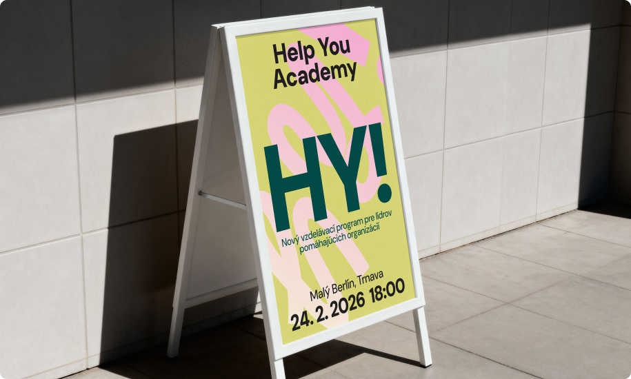
HY Academy | A brand for the people who hold up the helpers.
 Branding that breaks taboo


 More work